Creating a Visualization
Perform the steps below to create a visualization, graphing the data collected.
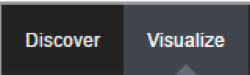
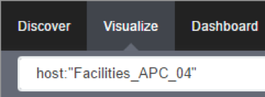
1. Click on Visualize:
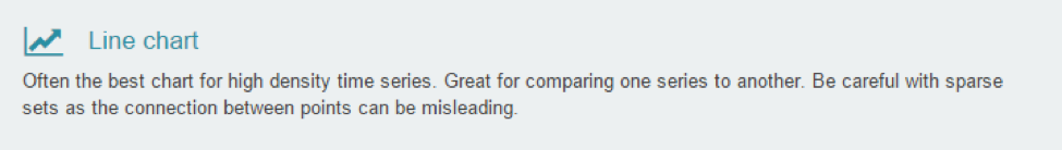
2. Select a Line chart:
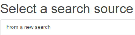
3. Select a search source by clicking on ‘From a new search’.
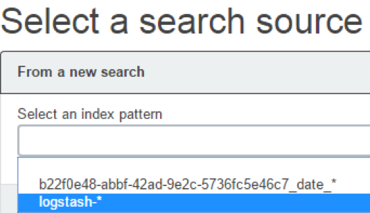
4. Select ‘logstash-*’ as index pattern.
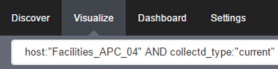
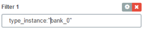
5. Select the data points you want to visualize by entering a search expression such as ‘host:”<device name>”’ in the search field.
The search expression can be extended to be more selective.
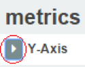
6. Click on the arrow to the left of Y-Axis to expand it.
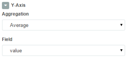
7. Select ‘Average’ for Aggregation and ‘value’ for Field.
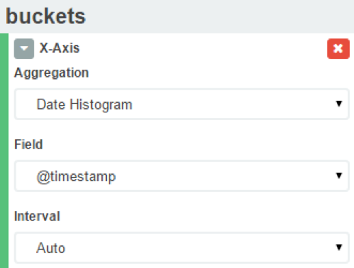
8. Click on X-Axis.
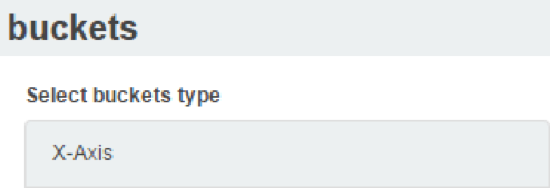
9. Select ‘Date Histogram’ as Aggregation. Leave Field and Interval as default.
If you just want your visualization to be a single-line graph, skip to step 18, as the next steps will split the data point set into a multi-line graph.
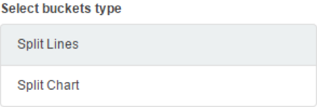
10. Click on Add sub-buckets to add multiple data points.
![]()
11. Click on Split Lines.
12. Select Filters as Sub Aggregation.
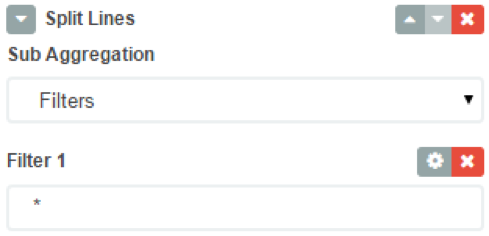
13. Enter a search expression to select the element you want to visualize.
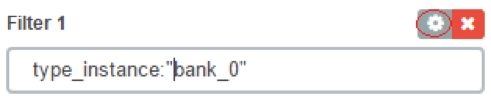
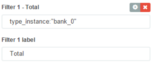
14. Optionally, associate a label by clicking on the settings icon.
15. And provide the label.
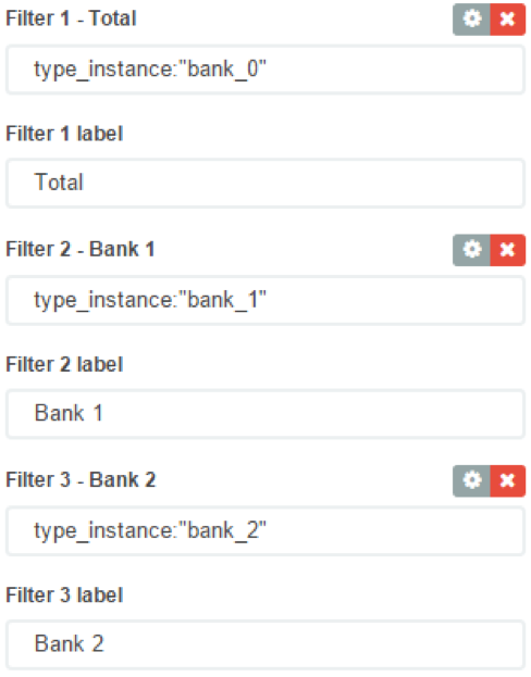
16. Click on Add Filter to add another element to the visualization.

17. Repeat steps 13 to 16 to add all desirable elements.
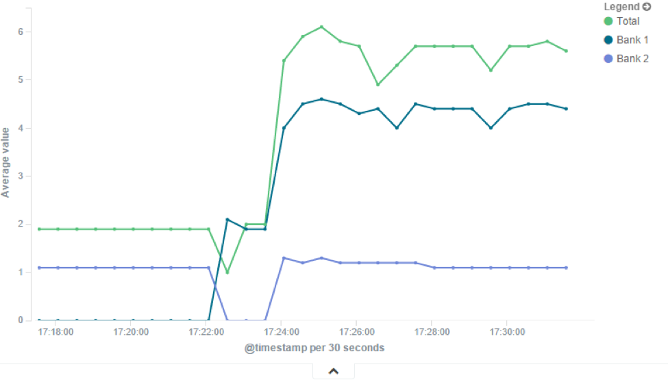
18. Click on the the green arrow to refresh the graph based on the configuration provided.

19. The graph should now reflect the configuration provided.
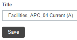
20. Click on the Save icon to save the visualization.
![]()
21. Provide a title for the visualization and click on Save.
Related Articles
Considerations on Visualization
Additional Considerations There is a lot of flexibility on creating visualizations, and the described steps cover only a small subset of what is possible. Other type of visualization is the area chart, which is useful for stacking measurements for ...Exploring Data Points
This section will describe how you can verify that we are actually persisting the data collected and to learn more about the data being collected. This knowledge will be helpful in the Creating a Visualization article. First, make sure that you have ...Creating a Dashboard
We can now create a dashboard and add visualization to it, so we can easily access the visualizations that share the same context. 1. Click on Dashboard. 2. Click on the new dashboard icon. 3. Click on the add visualization icon. 4. This will show ...Steps to create a monitoring dashboard of a PDU
Please, follow the instructions of the following articles, in this order: 1. Enabling Monitoring 2. Exploring Data Points 3. Creating a Visualization 4. Creating a Dashboard 5. Inspecting a Dashboard 6. NodeGrid Monitoring Aggregation Settings 7. ...NodeGrid Monitoring Aggregation Settings
Here is how to configure a monitoring aggregation. 1) Make sure you have a monitoring license installed. If you don't have one, add one via System > License 2) Make sure you have the devices you want to aggregate configured and monitoring is enabled. ...