Considerations on Visualization
Additional Considerations
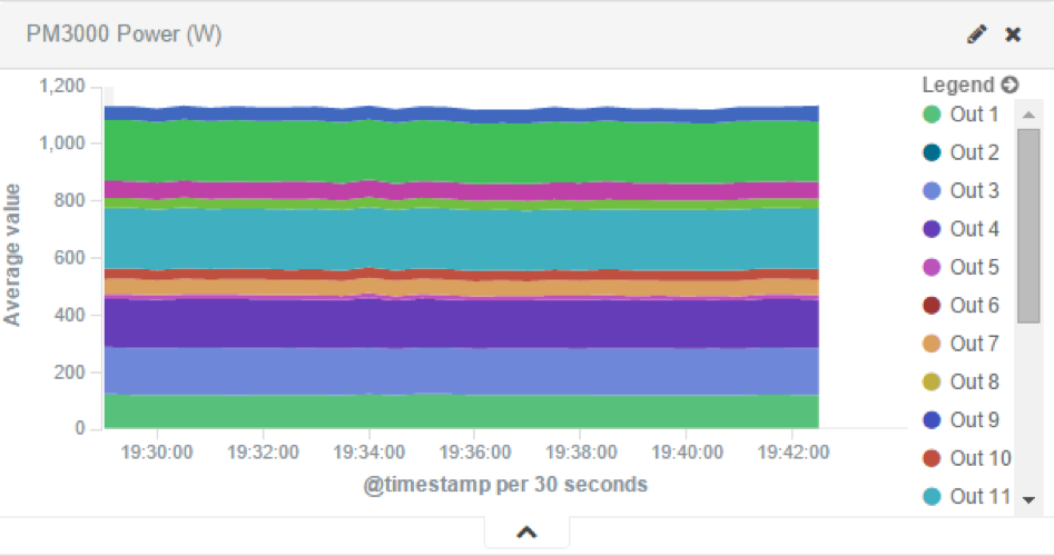
There is a lot of flexibility on creating visualizations, and the described steps cover only a small subset of what is possible. Other type of visualization is the area chart, which is useful for stacking measurements for different although related entities, such as the outlets of a PDU.
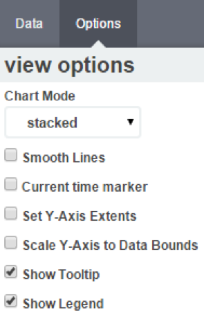
In order to achieve this, select Area chart instead of Line chart,

and configure the visualization options to have char mode as stacked.
This is the appearance of such a visualization:
All search expressions are used to select, or limit, the data points that will be used to compose the visualization. They can be used as a filter for the whole visualization, as sub-aggregation filters, or as a filter for the whole dashboard.
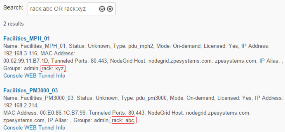
These search expressions are not restricted to the data points’ fields, but they can also refer to fields associated with the device in NodeGrid, such as type, IP address, authorization groups, custom fields, and more.
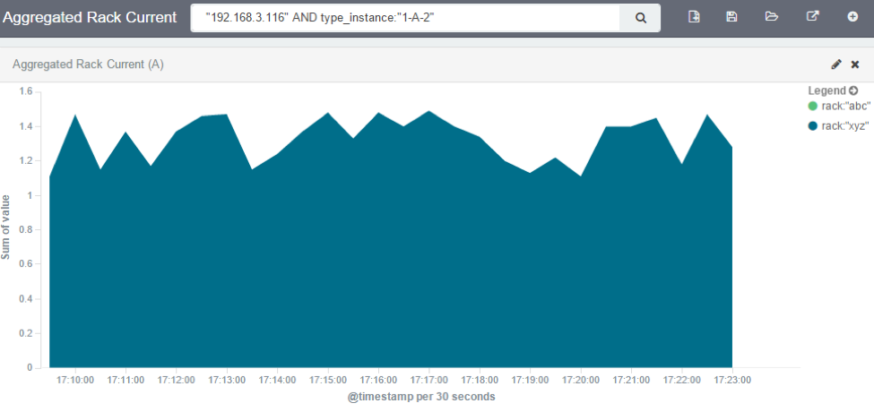
For example, we can collect the current provided by each of the outlets of a couple PDUs, one with custom field “rack:abc” and another with “rack:xyz”.
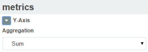
We can show the total sum of the current provided by the outlets of each PDU by setting the visualization aggregation as sum,
setting the buckets’ interval to match the collecting period,
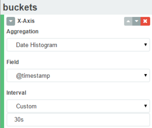
and using the custom fields as sub-aggregation filters.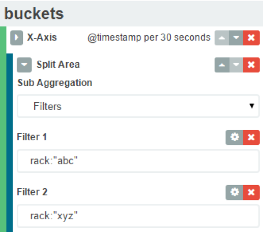
The resulting visualization would look like this:
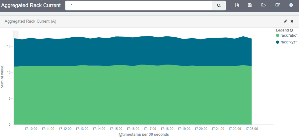
And we can filter out by entering the IP address of one of them:
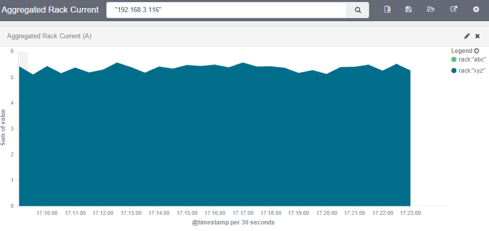
We can further filter out to get a single outlet, all from the same visualization.
However, we need to be careful to not account for the same measurement twice, like mixing power consumers and power producers, or a PDU’s input and output power.
Related Articles
Steps to create a monitoring dashboard of a PDU
Please, follow the instructions of the following articles, in this order: 1. Enabling Monitoring 2. Exploring Data Points 3. Creating a Visualization 4. Creating a Dashboard 5. Inspecting a Dashboard 6. NodeGrid Monitoring Aggregation Settings 7. ...NodeGrid Monitoring Aggregation Settings
Here is how to configure a monitoring aggregation. 1) Make sure you have a monitoring license installed. If you don't have one, add one via System > License 2) Make sure you have the devices you want to aggregate configured and monitoring is enabled. ...How to: Add OpenSearch Temperature visualization to Nodegrid
The Dashboard (WebUI only) allows visual presentations of Event activities, Managed Device details, and data monitoring. Multiple dashboards can be created for different purposes. For example, one to monitor managed device data points (i.e., Power ...Enabling Monitoring
Perform the steps below to enable monitoring for a device, using the interface of your choice, either the CLI or the web. Using the CLI Go to the device’s management settings: cd /settings/devices/<device_name>/management/ Configure monitoring for ...Customizing a Monitoring Template
There are a number of pre-existing monitoring templates, and if any of them satisfies your needs you can skip to the next section. All templates are text files located under the directories /etc/collectd.templates/snmp /etc/collectd.templates/ipmi ...